Musical Instruments


Yesterday I completed the last of the 100 drawings / paintings in the Trumpet Parts Series.

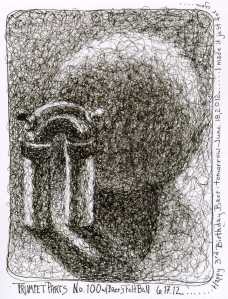
Trumpet Parts No. 100 with the felt ball I made for Baer’s 3rd Birthday (today).  The roving was from Tari’s sheep.

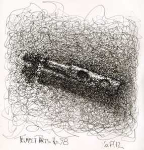
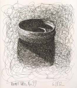
The last three drawings are ink squiggle drawings.  I will keep only my favorite piece, T2-R2, from the box of bent and broken trumpet parts.  I enjoyed every moment of working on the series.  The series began in April of 2011.  It documents the passage of time, the change of seasons, my interests, my experiments with a variety of media and styles, as well as the development of The Color Scheme Game.

Trumpet Parts No. 98

Most of the series was done in sketchbooks, helping me to fill the remaining blank pages of at least seven of the sixty-six incomplete sketchbooks on my bookshelves.

Trumpet Parts No. 99

The series acted as a mirror, making me aware of my work habits, my style preferences, my color preferences as well as the consistency of quality (and absence of quality) that is directly connected with the level of focus on the work.

The entire series (minus a few that were horrific) may be viewed in the Trumpet Parts Album of  my facebook page Chris Carter Artist.

Moving on …….

Sketchbook Drawings:  drawn with Noodler’s Neponset fountain pen (fabulous pen!) filled with Noodler’s Heart of Darkness Ink.

I couldn’t resist at least one more ink squiggle drawing of my Trumpet Parts before I reach the end of the series.

Trumpet Parts No. 97, Ink Squiggle Drawing

I find myself having rested on my current plateau a tad too long, staring at the rock face of the cliff on the far end of the plateau.  Time to start the ascent to the next level.  With that in mind, I will be posting less frequently on this blog as well as the Creative Color blog, perhaps only once or twice a week.  Thanks for viewing the blogs, for your comments, and for your continued support.

Sketchbook drawing: drawn with Noodler’s Neponset fountain pen filled with Heart of Darkness Ink.

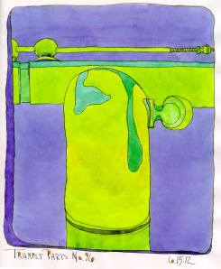
This modified triad color scheme is the same as an extended analogous color scheme with two colors omitted.

Trumpet Parts No. 96

Blue / Violet, Blue / Green and Green / Yellow.  The Two colors omitted are Blue and Green.  I felt like the color sketch was screaming for a bit of orange so I filled in the closed shapes in the title and date.  Whew….. a bit of relief from the overpowering frogginess of the trumpet parts.

Sketchbook color sketch: drawn first in ink with fountain pen, followed by watercolor on thin, wrinkly paper.

The day began with my banana disguising itself as my tea tin.  Now my little trumpet part is playing the same game.

Masquerades

Normally I would be breathing flames after an entire day spent wrestling with my computer, creating a new website.  I can no longer edit my Yahoo Site, the editing program works neither with my Mac nor Tom’s Windows 7.

I started my first website with Yahoo sixteen years ago.  About seven or eight years ago they discontinued serving my site when they redesigned their programs.  I stayed with Yahoo, but had to rebuild my site from scratch, I couldn’t transfer anything from the old to the new, including my domain name.  After switching to Mac, I’ve been faced with the task of starting from scratch again.  Time to say goodbye to Yahoo!

I’ve been at it since 4 am this morning, bungling my way through the GoDaddy Tonight software after wasting time having purchased hosting rather than a website.  That’s what I get for starting the day at 4 am.  GoDaddy was great about making the change for me.

The new site will be extremely basic, mostly minimal galleries of newer work.  If all goes well, I’ll go live with the site tomorrow!

I’m grateful to my banana, my trumpet part and my tea tin for making me smile throughout this challenging day.

Sketchbook drawings: drawn with fountain pen and ink, followed by watercolor.

Sometimes the ink bleeds a bit too much.

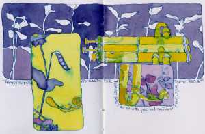
Trumpet Parts No. 89, Complementary Color Scheme

I’m going to try a few more experiments on this sketchbook drawing, but want to post the original version of it before I attack with more line drawing of pea plants and maybe a bit of gouache to tame the ink bleed.

The paper in my sketchbook is extremely absorbent.  I thought I had mixed plenty of the blue-violet mix for the background of the upper rectangle.  I hadn’t.  I ran out before I could complete the top left corner.  Not wanting a hard line, I quickly mixed what I thought might be close …. no time to test ….. have to keep the puddle moving.  I was a bit too blue and too saturated.

In spite of its problems, I had a great time both drawing and painting this combination of trumpet parts and the plants outside my back door.

Trumpet Parts No. 89 Revised

Later ….. I did add more ink and watercolor, but I didn’t add gouache to cover the bleed.

Sketchbook drawing: drawn first with Noodler’s Flex Fountain Pen followed by watercolor.  The color scheme and dominant color was determined by the throw of my twelve-sided die.  Complementary Color Scheme (Violet and Yellow)

I should have been at a jam, painting my friends making music together.  Instead, I was at ArtWalk in downtown Bethlehem on Memorial Day Weekend (when everyone has left town) in the middle of a thunderstorm.  Sitting outside with one’s art is not the best choice in the pouring rain.  Fortunately, I was able to move inside and spend a couple of ours catching up with a good friend, Gayle, who was minding the shop at Artfully Elegant.  Thanks to Gayle, I didn’t go home and slit my throat.

When I find myself at the end of a rope ….. any rope ….. I tell myself that the answer to my problem is simply to get better at what I do.

New and old drawing tools

The trumpet parts had not lined up well in Trumpet Parts No. 87.  First thing this morning, I made myself a grid guide (inspired by the one I saw in Nikolay’s hand at a plein air event last month).  I carefully drew the bent trumpet part, checking and correcting…. checking and correcting. I even hunted down two erasers.  I rarely use an eraser.  Hah!  The parts lined up! I’m sure you can’t tell in this photo.  I incuded my Waterman Phileas fountain pen, and the great leather case (contribution from Nicole), in the photo because it’s about to make its mark on the paper.  Hopefully I haven’t destroyed the surface too much with all my erasures.  I’m not used to drawing in pencil first …. then inking.  I much prefer to start right in with ink and go where my eye leads me, even if it’s down a winding, nonsensical path.

As I near the end of this series of One Hundred Drawings of Trumpet Parts I am faced with a dilemma. A little voice inside my head continues to whisper “Do what you love and the money will come.”  Do what I love?  Should I start another 100 drawings of my bent trumpet parts?

What do I love to draw and paint?  I love drawing dancers in motion, musicians playing …. alone or with others ….. I love throwing paint and bringing nude figures out of the splotches and splatters …. I love plein air painting.  I love starting the day with an ink contour drawing of my bent trumpet parts and adding color with watercolor.

What do I love the most?  Right now I would have to say that it is painting to live music …. letting my dip pen dance across the paper and the watercolor flow over the ink to the patterns and rhythm of the music.  Is there a market for such a thing?  I doubt it.

What I find absurd is that all the other drawing and painting I do is just an exercise to get better at drawing and painting so that I can respond completely intuitively to that incredible moment of motion, rhythms and patterns I experience when listening to live music.

A huge thanks to all the musicians who have created those magical moments for me to attempt to express.

I didn’t really care about selling paintings last night at ArtWalk, I just wanted to share them with friends and strangers.  Of the two people who walked by, one of them made it worth the week of matting and the lugging back and forth all of the art.  She looked at the paintings and said ” How strange ….. when I look at these, I actually hear the music.”  She pointed to one ….. “I can hear the jazz of New Orleans in this one!”

Thank you!
Last night was the last of the Artsquest RiverJazz performances.  The Saucon Valley High School Jazz Ensemble opened for the Kevin Eubanks Jazz Band.  Another fabulous night of music !

Rene Camacho playing stand up bass with Kevin Eubanks

My favorite painting of the night is of Rene Camacho playing his unusual stand up bass.

I’ve posted the rest of the paintings on my ‘Chris Carter Artist’ Facebook page.  SteelStacks RiverJazz Musicians

Sketch: drawn first with dip pen followed by watercolor

Egon Schiele, one of my favorite artists, died at the age of twenty eight.  I am sixty and have not accomplished what he did in only twenty eight years. There is so much I  have left to do before I close my eyes for the last time.  There is so much I want to accomplish before my brain starts to let me down, if indeed it is going to let me down.  My father suffers from Alzheimer’s.  I feel as if I am in a race against the time bomb of Alzheimer’s.  Perhaps I will escape it….. perhaps not.  Each day I eliminate more of the elements of my life that sap my time and energy.  I haven’t any time or energy to spare.  It all boils down to what lights my flame.

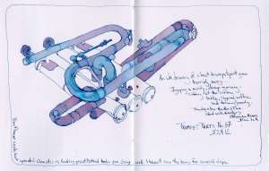
Bent Trumpet Parts No. 87

I don’t know if I will enjoy the series of Hedgerows as much as I have enjoyed the series of bent trumpet parts.  Only time will tell.  I have only thirteen more trumpet parts drawings to go.

The proportions of this drawing went totally awry.  I didn’t paint the lower three sections because it would then be even more obvious how drastically wrong the drawing is.  What I love about drawing directly with ink is that there is no going back.  It is what it is.  It’s not about being perfect, it’s about observing more carefully.

Sketchbook line drawing: drawn first with Noodler’s Flex fountain pen filled with Nodler’s Ottoman Azure ink, followed by watercolor.  Analogous color scheme….. purple blue as the dominant color.


Feels great to return to the Trumpet Parts Series.

Trumpet Parts No. 86

After working on the monochromatic wall mural for two weeks straight, playing with brilliance of watercolor on my trumpet parts was a welcome change.  I stayed with an extended analogous color scheme, avoiding blue through red.

Only fourteen more trumpet part drawings to go….. How sad it will be for the series to end.

Sketchbook drawing:  Drawn first with fountain pen followed by watercolor.  The purple, vertical lines are the stitches in my coptic bound watercolor paper sketchbook.

I received two Noodler’s fountain pens, a Neponset and a Konrad, as well as a bottle of Noodler’s Rome is Burning ink for being one of forty winners of the Catfish Drawing Contest.  I really wanted the grand prize (as I’m sure everyone else did, too.) which was one of every fountain pen Noodler’s makes.  I’m smiling anyway.  How can I be grumpy when I have two new fountain pens to play with?

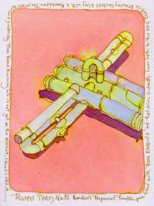
Trumpet Parts No. 81, ink and watercolor

I immediately tested the bleed of the Rome is Burning ink.  It dried instantly and showed no signs of bleed at all.  I tested the ink on cardstock.  The Rome is Burning appeared to fall into the category of ‘browns‘.  It is a new color from Noodler’s that’s not yet available to consumers.  Upon second look at my test, the color appeared to be somewhat green rather than brown.  The quick drying quality of the ink, and the fact that it didn’t bleed when water was brushed over the dried lines makes it useful to me for my ink and watercolor sketches when I want consistency of line and color. I promptly filled the Neponset pen with the Rome is Burning ink and drew Trumpet Parts No. 81.

You can imagine my surprise when I added a wash of watercolor to the drawing and the ink bled into the color.  I was drawing on Rives bfk paper.  Obviously the paper made a huge difference.  Since most of my inks bleed on the cardstock, I’m not surprised when they bleed on the Rives bfk paper.  Since the Rome is Burning hadn’t budged on the cardstock I assumed there would be no bleed on the Rives.  I was wrong.  The bleed was neither brown nor green.  An iridescent yellow, similar to the coloring found in vaseline glass, appeared.  I saw a similar, odd, separation of colors in another artist’s work, Anachroneironaut, in which she used Noodler’s Dr. Zhivago ink.  Funny thing is, I was hoping that if I received a free bottle of ink it would be the Dr. Zhivago ink.  I may not have won the entire set of fountain pens, but I did receive ink that’s similar to the one I wanted.

Testing paper is as important as testing ink, pens and brushes.  The Rives bfk paper swallows the intensity of colors.  I like the surface and I enjoy drawing and painting on it.  I am glad that I learned the the Rome is Burning ink bleeds on it before spending hours on a larger, more detailed ink drawing expecting to be able to wash over it safely with watercolors.

Sketchbook drawing:  Trumpet Parts No. 81. Drawn first with fountain pen followed by watercolor.

Next Page »